The first step of your website is driving traffic. So, what happens next is whether that visitor stays, scrolls, clicks, or leaves the website will depend on one thing: your landing page.
We should know that the high performing brands always know that a Landing page isn’t just about aesthetics. They always focus on purpose-driven design, persuasive messaging, and thoughtful testing. There is always a well-structured landing page that has the power to turn casual visitors into loyal customers, and that’s exactly what sets high converting pages apart for them.
Now, let’s explore what goes into creating landing pages that convert, with lessons straight from top-performing brands.
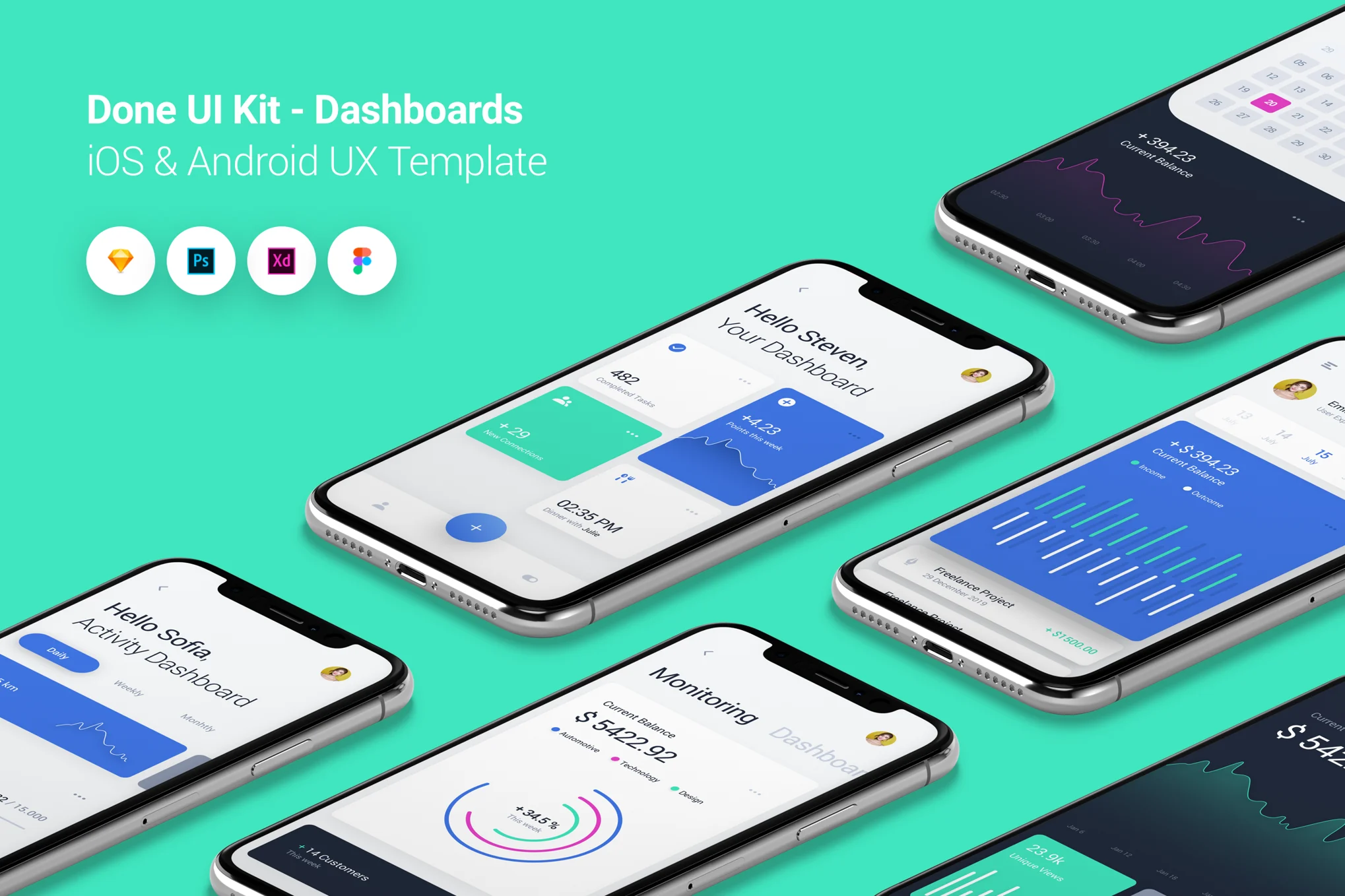
UI/UX is the first impression that works
UI/UX should be more user friendly and attractive. When users visit our page, the first few seconds determine whether they’ll stay or bounce. This is where UI (User Interface) and UX (User Experience) design come into play. It’s not enough to look good for the page needs to feel effortless to navigate and pleasant to use.
The Best Practices from Leading Brands are
- We need to keep only what’s necessary and every element should support the user journey.
- Most of users who is browsing on smartphones, responsive design is no longer optional.
- Most users abandon those pages whtakes longer than 3 seconds to load, most users abandon it.
- We need to use font sizes, colors, and positioning to guide attention of the important content that should always stand out.
The landing page structure of Apple is what we need to take reference. They don’t clutter the screen, but they guide users visually from headline to call-to-action in a clean, engaging flow.
Copywriting That Drives Action
Your words are what convince them to take action, whereas design might draw someone in. Copywriting is one of the most overlooked yet critical components of a high-converting landing page.
What Effective Copy Looks Like:
- Headline that has hooks: Your headline should solve a problem or highlight a benefit in just one sentence.
- Subheadline that has clarity: It supports your headline and answers the question, “Why should I care?”
- Simple content: We should write in short paragraphs and use bullet points because most people prefer to scan content rather than to read every word.
- Simple call-to-action method: The call-to-action should be clear, confident, and easy to spot.
- More focus on giving messages: Talk less about features, and more about how those features help the user.
One good example is Dropbox. Their landing page doesn’t overwhelm with text, but it communicates value quickly and keeps life organized and work moving all in one place.
A/B Testing and Heatmap Insights
Even with the best design and copy, there’s always room for improvement, and that is A/B testing and heatmaps to make data-driven decisions.
Let’s talk about A/B Testing:
A/B testing means making two versions of a page with one small change which is like the headline or button color, to see which one gets better results.
- You can also discover surprising results like how a single word change in a CTA which can increase conversions.
- For example, changing “Try for Free” to “Start Your Free Trial” for boosting sign-ups which depends on your audience.
Heatmaps:
These tools show how users interact with your page, where they click, scroll, or lose interest.
- Heatmaps reveal whether users are missing important info because it’s too far down the page.
- Heatmaps help you understand what parts of the page get the most attention and which parts get ignored.
Bonus Elements That Can Boost Conversions
Psychological and trust-building elements often include high-converting design and copy. These extras can help reduce hesitation and nudge users to take that next step.
Add-ons that Work are
- Customer testimonials, star ratings, and user counts build trust.
- We use limited-time offers, countdown timers, or low-stock indicators.
- We include secure payment icons, SSL certificates, or partnership logos to reassure users.
Final Takeaway is your Landing Page, which should work for you
High-converting landing page is much more than a pretty design. It’s a carefully built experience that guides users from curiosity to commitment. When you combine:
- Smart design (UI/UX)
- Clear, compelling copy
- Data-backed testing
- Trust-building elements
Remember, your landing page is often the first impression to a visitor to get of your brand.
Do you need help improving your landing page?
Brand Ghar, we craft landing pages that do more than just look good. We help your brand grow online with more leads, sign-ups, sales, design, content, and even data.
📩 Reach out to us for a free landing page review and start turning clicks into customers.